
Design Style Guide: Mastering Qi Baishi Chinese Freehand Ink Wash & Contemporary Minimalist AI Design
One Master Prompt to Paint Like Qi Baishi: Chinese Freehand Ink Wash & Contemporary Minimalist AI Design
Created by classically trained Chinese artist Lucidity (@darkmirror_N), this system prompt architecture brings Qi Baishi's freehand ink wash spirit into GPT-Image 2.5. Merging spontaneous brushwork, deliberate negative space, and contemporary museum editorial layout.
Master Case Studies: Contemporary Chinese Art Posters
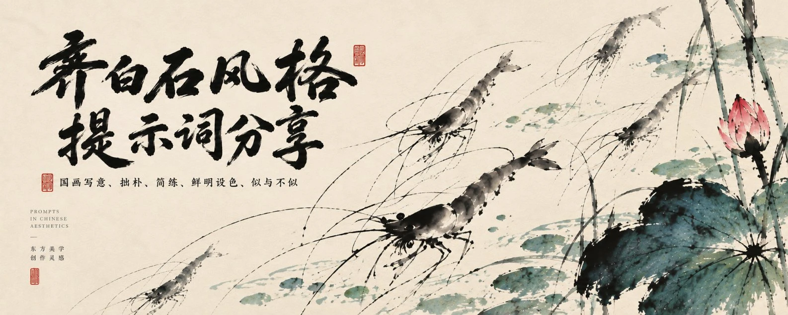
01. Panoramic Scroll: Free Swimming Fishes
Wide panoramic scroll composition with extensive negative space functioning as water.
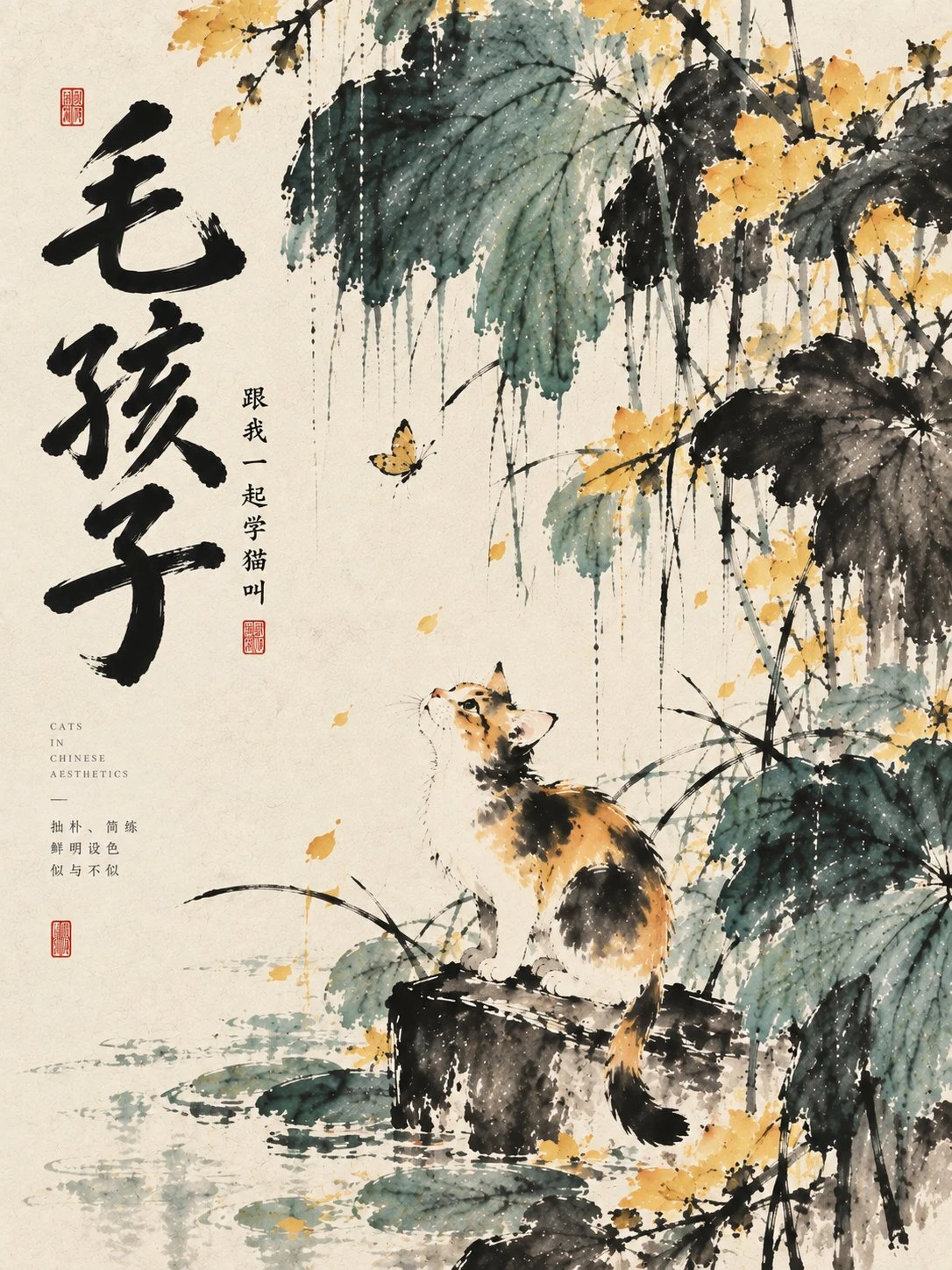
02. Furry Child: Ink Wash Cat
Bold splash ink capturing feline playfulness with calligraphic dry-brush whiskers.
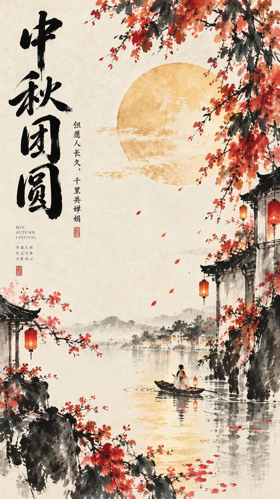
03. Mid-Autumn Reunion: Harvest Still Life
Warm gamboge fruits with wet ink leaves organized in a balanced circular dynamic.
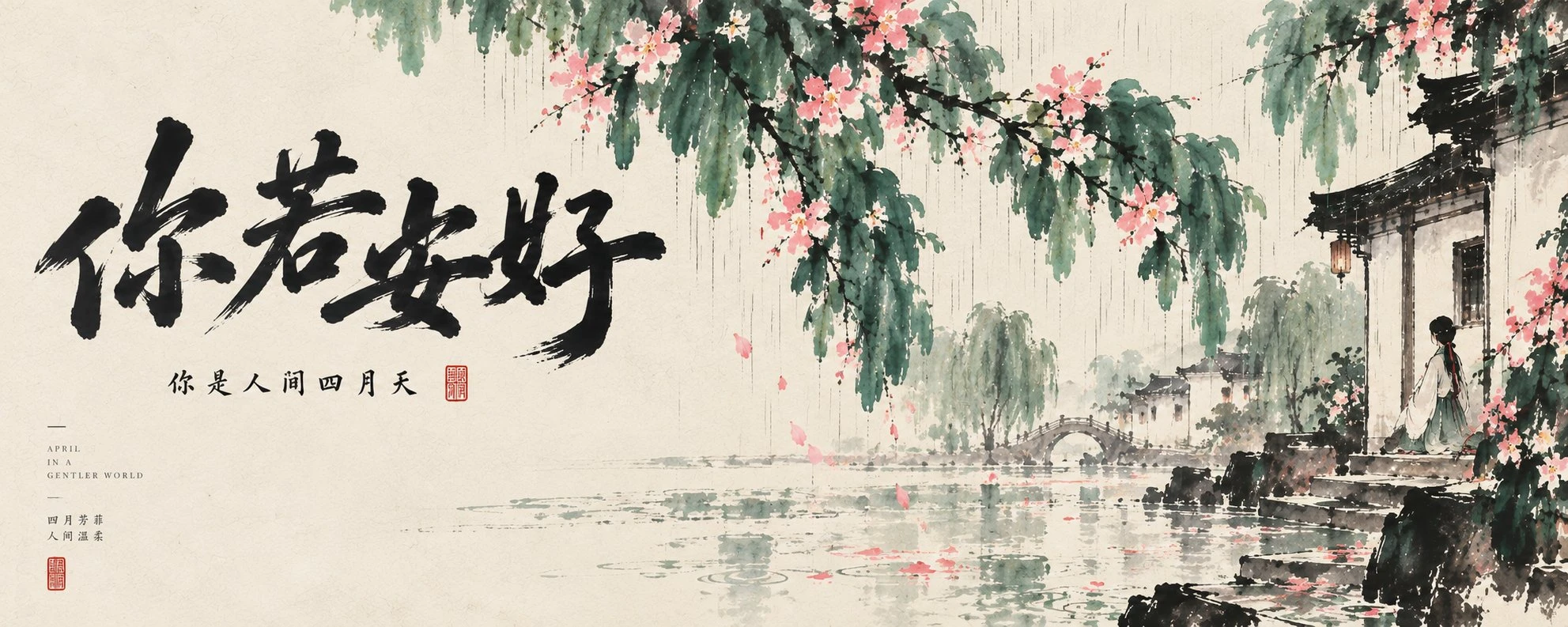
04. Serenity: Red Lotus & Heavy Ink
Iconic red lotus paired with heavy black ink leaves across a tranquil horizontal vista.
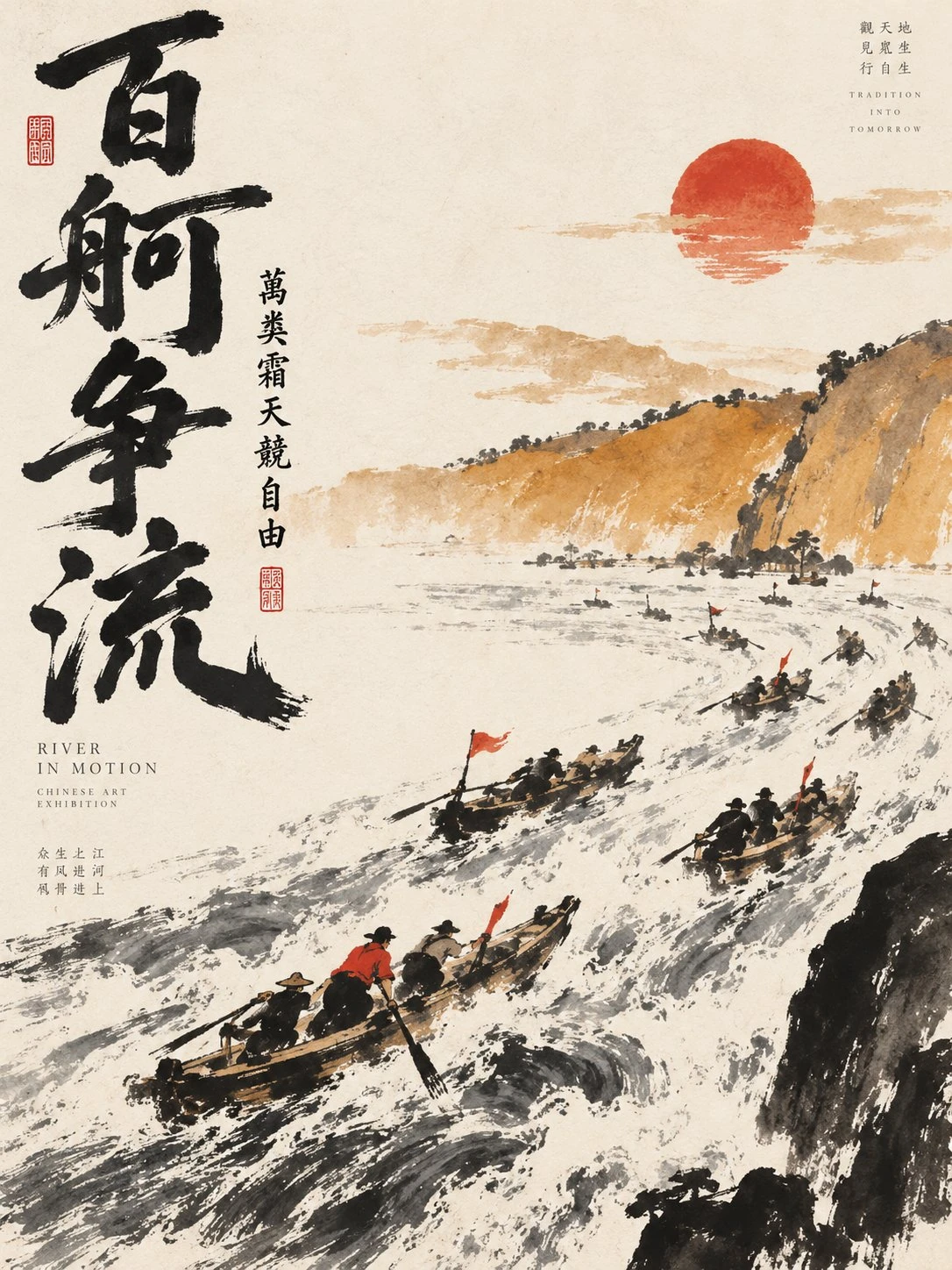
05. Hundred Boats: Swimming in Emptiness
Sparse, countable brushstrokes rendering aquatic motion without painting actual water.
The Three Pillars of Qi Baishi's Freehand Art
Bold Spontaneity (大笔挥洒)
Decisive, calligraphic brushstrokes made with complete conviction. Avoid digital trace lines and uniform outlines. Stems and rocks are rendered with deliberate ruggedness.
Visible Brush & Ink (见笔见墨)
Rich ink gradations ranging from dry flying white to saturated pitch black. Colors naturally seep into xuan paper fibers, creating luminous layers without cheap filters.
Countable Strokes (笔笔可数)
“Between likeness and unlikeness.” Distill essence rather than photographic detail. A few strokes evoke the full weight of a creature, surrounded by breathing negative space.
12-Module System Prompt Architecture
使用温润、干净的暖象牙白宣纸或高级手工艺术纸,保留极其细微纸张纤维与吸墨渗透质感。严禁做旧泛黄与随机脏污。
浓墨、淡墨、焦墨、湿墨、干笔飞白,线条必须有粗细轻重快慢变化,一气呵成,避免反复描边与修饰。
不画照片式繁琐写实,提取最具识别度的轮廓与动态,夸张笔势,让观者凭少量笔墨感受生命神韵。
花木(泼墨叶片、没骨花瓣)、虾蟹游鱼(透明层次、灵动长须)、鸣禽(羽毛重心)、蔬果山石(大胆色墨焦点)。
宣纸暖白 + 墨黑 + 主色(朱砂红、胭脂红、石青、石绿、藤黄、赭石)。墨色建骨架,鲜色负责点睛,克制不喧宾夺主。
纵向生长(向上拔擢)、横向舒展(辽阔平静)、斜向穿行(速度风感)、环形聚合(松散回环)。
不对称构图,大片暖白 × 一簇浓墨,巨大留白 × 一枝朱红花卉,主体偏置,宁少不可塞满。
自然毛笔题字,具有碑帖金石风骨,错落排列,绝不使用普通电脑楷体或商业大字;题跋自然依附画面呼吸。
融入极小尺度的现代英文注释(FIELD NOTES, ART STUDY, 年份),搭配 1-2 枚极小朱砂小篆印章作为视觉锚点。
按小红书、推特、壁纸与艺术海报重构视线安全区;严格禁止仙侠古风大黑山、渐变荧光与 AI 水墨杂讯。
Qi Baishi Ink Wash & Contemporary Studio
Select classic presets or customize traditional mineral colors, dynamic motifs, and editorial safe zones.
毛孩子
见笔见墨,方得真趣
【用户输入】
【主题】:毛孩子
【主色】:赭石
【核心物象】:猫与雀鸟
【视觉动势】:纵向生长
【中文标题】:毛孩子
【中文题跋】:见笔见墨,方得真趣
【应用场景】:小红书封面
【画幅】:3:4

━━━━━━━━━━━━━━
【核心任务】
━━━━━━━━━━━━━━
根据用户输入的【主题】,创作一张高完成度的“齐白石大写意精神 × 当代中式极简设计”艺术视觉作品。
整体不是古画复制,不是传统国画装裱,也不是简单在现代海报上加入水墨素材。
以齐白石绘画中的大写意精神为核心,提取其拙朴、简练、鲜活、金石笔意、大胆设色、似与不似、大面积留白与生活情趣,将其重新转译为具有当代 Editorial Design、艺术出版物与美术馆展览视觉气质的东方极简作品。

根据【主题】【核心物象】【主色】【视觉动势】【应用场景】与【画幅】重新设计每一张作品。
不要固定模板,不要简单换色,不要重复相同构图。

画面应同时具有:
齐白石式大写意的生命力,
中国传统纸本绘画的手工感,
现代平面设计的构成意识,
高级艺术出版物的克制感,
以及当代东方视觉的留白与秩序。
About the Author & Inspiration
Created by Lucidity (@darkmirror_N), a classically trained Chinese traditional artist and AI trainer who spent months distilling Qi Baishi's freehand spirit into multimodal AI models.
Freehand art thrives between likeness and unlikeness. Generative AI becomes an emotional bridge connecting centuries of Eastern ink traditions with modern editorial elegance.
Explore More Image Guides
Back to Hub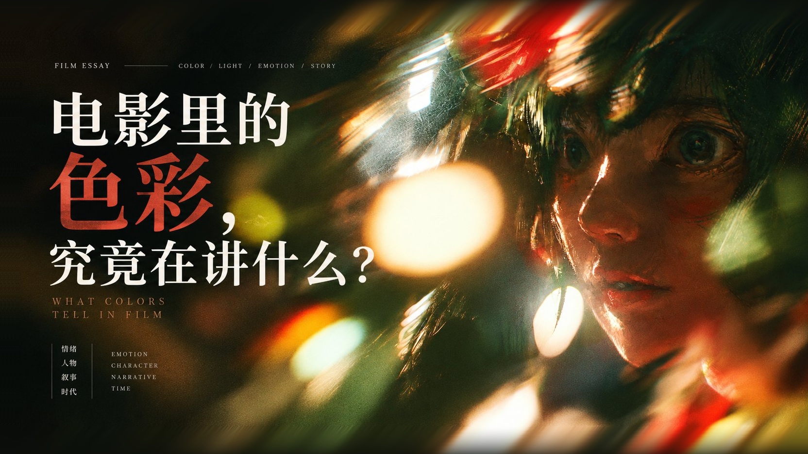
What Colors Tell in Film: Decoding Cinematic Color Storytelling from In the Mood for Love to The Grand Budapest Hotel
Black bars and teal-orange filters do not automatically create a cinematic feel. Through 10 high-resolution frame comparisons across In the Mood for Love, Moonlight, Raise the Red Lantern, Blade Runner 2049, and The Grand Budapest Hotel, learn how Hue, Value, Saturation, and Dominant/Secondary/Accent color hierarchy work with light, character placement, and spatial scale to tell a story.
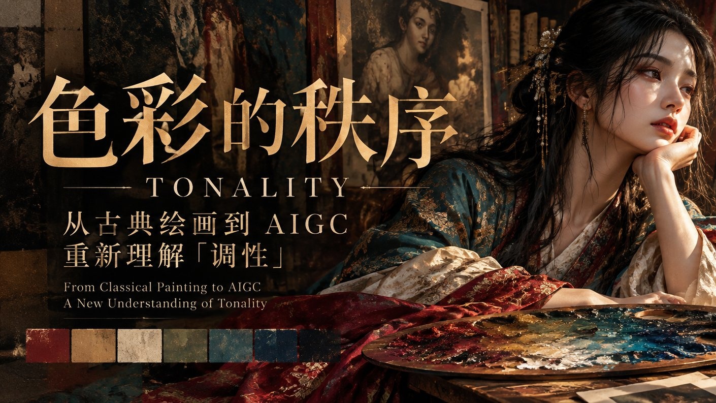
The Order of Color: From Classical Painting to AIGC, Re-understanding "Tonality"
Tonality goes deeper than color palettes—it is the overarching visual order governed by Value Structure, Chroma Relationship, Temperature Interplay, and Area Proportion. Through Rembrandt, Vermeer, and Hammershøi masterworks, learn how to write true tonal-harmony AIGC prompts.
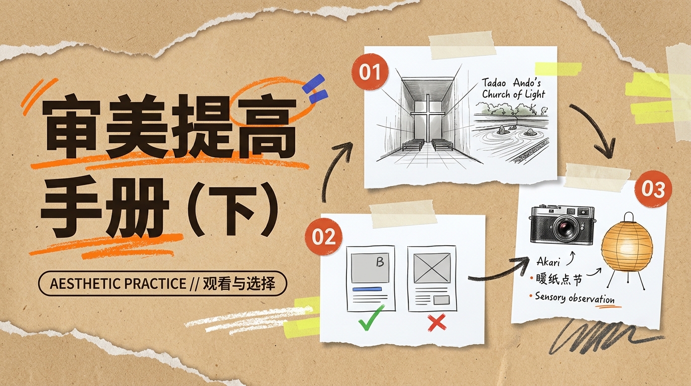
Aesthetic Improvement Handbook in the AI Era (Part 2): Master Observation, Single-Variable Comparison & Real-Space Practice
How do you practically cultivate aesthetic judgment? Through 26 high-resolution plates—spanning Ryoan-ji rock garden, Chichu Art Museum, Matthew Butterick typography comparisons, Monet's Wheatstacks, Tadao Ando's Church of Light, Peter Zumthor's Therme Vals, Isamu Noguchi's Akari lantern, Henri Cartier-Bresson, Michael Wolf, and Hiroshi Sugimoto—this handbook builds an actionable aesthetic training loop.
Need Autonomous Agents?
Explore multi-agent workflows, enterprise RAG, and local LLMs.