Color Theory: Tonality Order# Style Guide•8 min•Author: Zidan 子丹 @liluocheng13

The Order of Color: From Classical Painting to AIGC, Re-understanding "Tonality"

Tonality goes deeper than color palettes—it is the overarching visual order governed by Value Structure, Chroma Relationship, Temperature Interplay, and Area Proportion. Through Rembrandt, Vermeer, and Hammershøi masterworks, learn how to write true tonal-harmony AIGC prompts.

Z
Zidan 子丹✓@liluocheng13
AI Filmmaker & Art Director · 40+ Years in Fine Art, Oil Painting & Thangka · MA in Art History
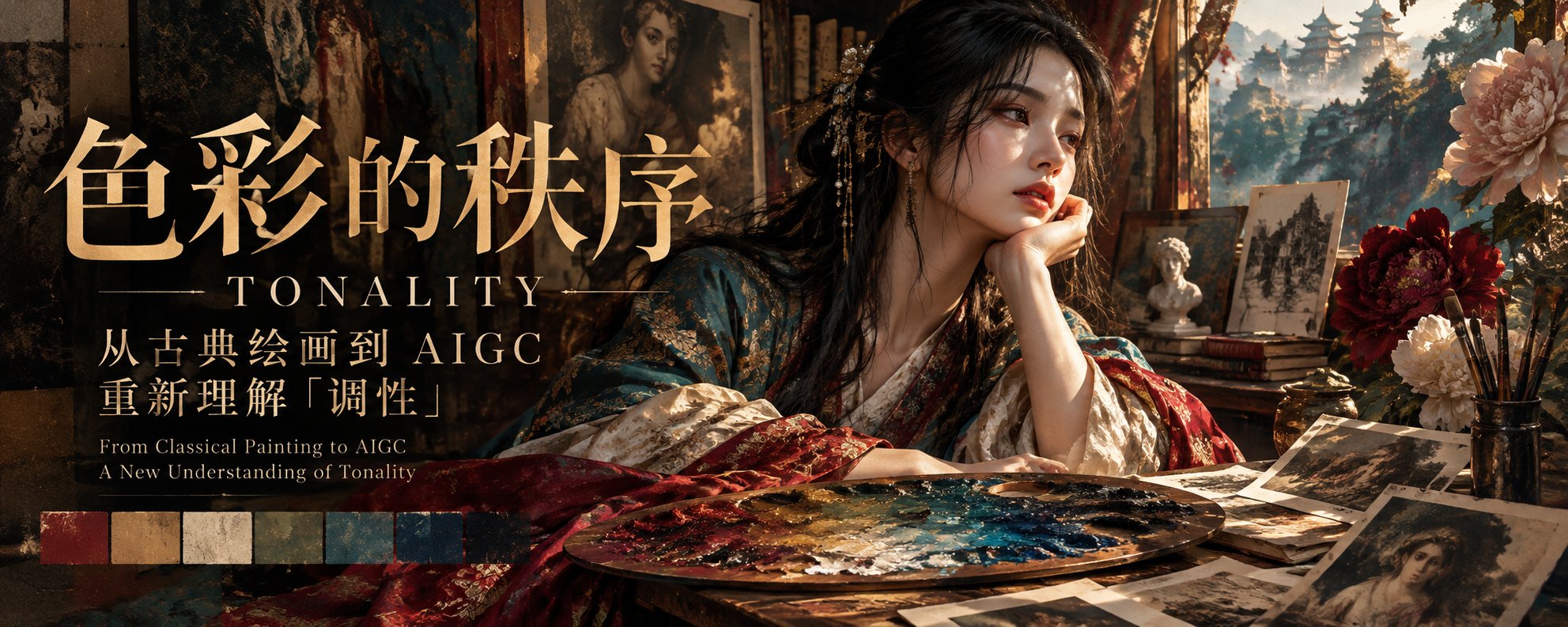
色彩的秩序:从古典绘画到 AIGC,重新理解“调性”(Tonality)原帖头图
Click to enlarge
Measured Canvas Color Area Proportion
Deep Umber61.3%
Warm Ochre16.0%
Warm Ivory6.3%
Muted Turquoise3.8%
Deep Crimson3.0%
📷 Original Article Banner: "The Order of Color: From Classical Painting to AIGC, Re-understanding Tonality" — by Zidan (@liluocheng13)
Core Definition: What is "Tonality" in Fine Art Color Theory?

在美术专业的色彩学中,“调性”(Tonality)是指一幅作品中,由色彩的明度、纯度、冷暖倾向及其相互关系(含面积比例)共同形成的整体视觉秩序与情绪特征。

它不仅是颜色的搭配,更是画面中所有色彩服从于某种统一关系的结果。从专业绘画的角度来说,理解“调性”,需要区分三个相互关联的概念——色相(Hue)、色调(Color Tone)与调性(Tonality)。

01一、色调(Color Tone)与调性(Tonality)的区别

色调(Color Tone)主要回答:这幅画在色彩上呈现什么总体倾向?例如:

暖色调 (Warm Tone)

赭石、朱红、金黄占主导。

冷色调 (Cool Tone)

群青、灰蓝、青绿占主导。

灰色调 (Grey / Muted Tone)

整体色彩纯度较低,呈现含蓄、柔和的视觉效果。

而调性(Tonality)则进一步回答:这些颜色以怎样的关系组织在一起,形成什么样的视觉气质?

例如,同样是以蓝色为主的画面,可以具有截然不同的调性:

Case A · Low Value & Low Chroma Blue

低明度、低纯度的蓝色调性

安静、克制、忧郁,强调微妙的明度关系。

Case B · High Chroma & Intense Blue

高纯度、强烈的蓝色调性

鲜明、直接,具有强烈的色彩张力。

两者都有蓝色倾向(同属冷色调),但视觉感受和色彩组织方式完全不同。

02二、决定画面调性的四个主要因素

1. 明度关系(Value Structure)

画面整体偏亮还是偏暗?明暗反差是强烈还是柔和?

高明度调性通常轻盈、明朗;低明度调性通常深沉、内敛。但情绪并非由明度单独决定。

2. 纯度关系(Chroma Relationship)

色彩是鲜艳饱满,还是经过灰化处理?

例如,一幅以灰绿色、灰蓝色和暗赭石构成的作品,即使局部出现鲜红,也未必破坏其低纯度的整体调性。相反,鲜红可能因为周围低纯度色彩的衬托而成为视觉中心。

3. 冷暖关系(Temperature Relationship)

冷暖不是简单地将蓝色定义为冷色、红色定义为暖色,而是色彩之间的相对关系。

例如,在大片冷灰色背景中,一小块暖赭石就能产生明显的视觉温度变化。

4. 色彩的面积比例与主次关系(Color Proportion and Hierarchy)

这是绘画实践中非常重要、也容易被忽视的一点。

一幅画的调性,并不取决于使用了多少种颜色,而取决于哪些颜色占据主导面积,哪些颜色作为辅助,哪些颜色承担视觉强调。

03三、为什么说调性比配色更深一层?

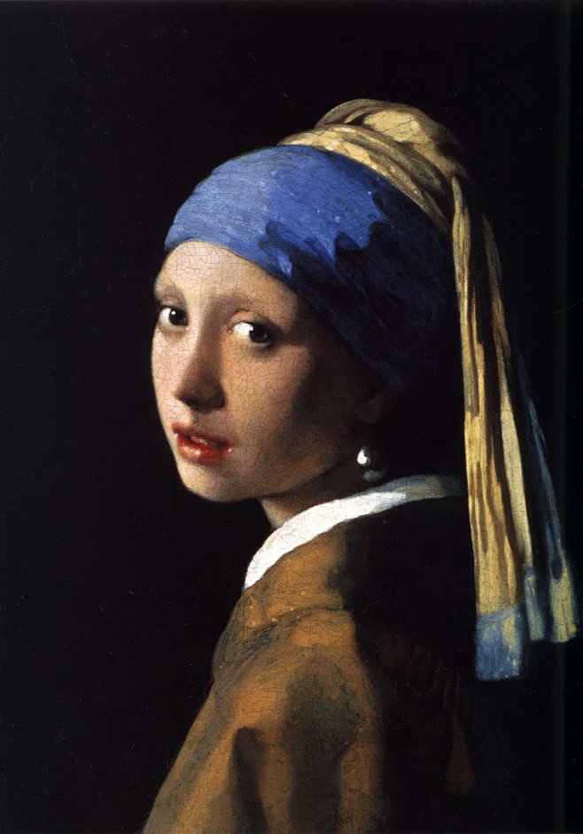
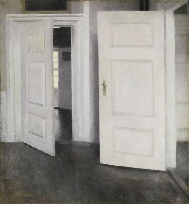
我用古典油画举个例子。伦勃朗(Rembrandt)、维米尔(Vermeer)与哈默修伊(Hammershøi),都非常重视画面的整体调性,但他们对明度跨度、冷暖关系、色彩纯度的控制各不相同。
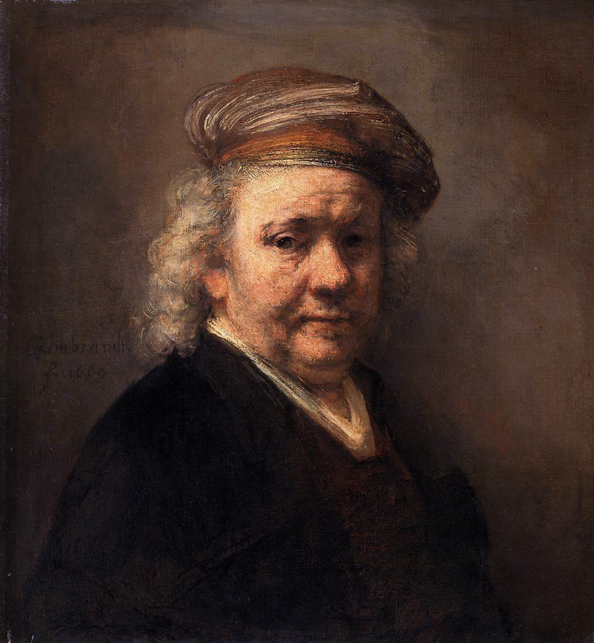
伦勃朗《63岁自画像》(Self-Portrait at the Age of 63, 1669)
Click to enlarge
Measured Canvas Color Area Proportion
Deep Umber88.9%
Warm Ochre8.0%
Burnt Sienna1.9%
Lit Ivory1.2%
📷 伦勃朗(Rembrandt van Rijn, 1669):极低明度暗褐统摄全局(88.9%),受光面以暖金赭石层层递进。
维米尔《戴珍珠耳环的少女》(Girl with a Pearl Earring, c. 1665)
Click to enlarge
Measured Canvas Color Area Proportion
Obsidian Void78.6%
Yellow Ochre9.0%
Ultramarine3.0%
Lit Flesh2.5%
📷 维米尔《戴珍珠耳环的少女》:78.6% 纯黑背景隔绝干扰,群青头巾与柠檬黄/暖赭石构成精准冷暖互补。
哈默修伊《白色的门》(White Doors, 1905)
Click to enlarge
Measured Canvas Color Area Proportion
Warm Chalk Grey65.5%
Cool Slate Grey33.9%
📷 哈默修伊《白色的门》:高度压缩中间调明度跨度,65.5% 暖灰白与 33.9% 冷炭灰构建极致静谧。

尤其在古典油画中,局部色彩可以丰富,整体调性却必须统一。

一块鲜艳的红布,并不意味着整幅画必须具有鲜艳的色彩调性。它可以被深褐色背景、灰化的肤色和柔和的光线约束在统一的视觉秩序中。

这也是为什么有些作品颜色很多,却不显杂乱;有些作品只用了三四种颜色,却依然显得不协调。

04四、放到今天的 AIGC 图像创作中

调性的控制,实际上比简单指定色卡更复杂。比如我们在提示词中写:

初级写法:仅确定色彩组合(Color Palette)
Muted turquoise, antique gold, warm ivory and deep crimson.

局限性:这只是确定了一个色彩组合(灰青、古董金、暖象牙白与深绯红)。生成模型不知道谁占大面積、谁是点缀,极易把四种颜色五五开地平铺在画面里,导致画面花乱失序。

专业写法:完整规定调性关系(Tonality Order)
Low-chroma tonal harmony, compressed midtone values, restrained warm-cool contrast, dominant muted turquoise, with small accents of deep crimson.

美术逻辑拆解:我们才开始真正规定画面的调性关系:以低纯度为基础(纯度)→ 压缩中间调的明度跨度(明度)→ 控制冷暖对比(冷暖)→ 让灰青色成为主导、以少量深红色形成视觉强调(面积主次)。

当然,生成模型未必能精确执行每一项要求,但这种描述在美术逻辑上更加完整。

05五、我认为最适合美术专业的一种概括

“色相决定颜色是什么,色调决定画面偏向什么颜色,而调性决定这些颜色如何共同构成一个完整的视觉世界。”

—— 也就是说,调性不是简单的统一颜色,而是让不同的颜色拥有共同的语言。

01 · HUE (色相)
决定颜色是什么
如群青、朱红、柠檬黄、焦茶
02 · COLOR TONE (色调)
决定画面偏向什么颜色
如暖色调、冷色调、灰色调
03 · TONALITY (调性)
决定如何构成完整视觉世界
明度 + 纯度 + 冷暖 + 面积主次秩序
学术细节补充:关于“色调”与“调性”的术语边界

还需要补充一个学术上的细节:中文美术教学中,“色调”与“调性”并没有绝对统一的术语边界。有些教学体系会将二者近似使用;在强调明暗组织的语境中,tonality 还可能特指明度调性,而不包含全部色彩关系。

如果用于专业绘画评论,我更倾向于把“调性”理解为统摄局部色彩关系的整体视觉秩序。也就是说,调性不是简单的统一颜色,而是让不同的颜色拥有共同的语言。

Interactive Studio · 4D Color Tonality Prompt Architect

Upgrade from Flat Color Lists to 4D Tonality Order

Select one of the 4 master tonality paradigms below and enter your subject to synthesize a complete 4D tonality prompt (Value + Chroma + Temperature + Area Hierarchy):

4D Tonality Breakdown & Area Hierarchy
Muted Turquoise (65%)Antique Gold (18%)Warm Ivory (10%)Deep Crimson (7%)
1. 明度关系 (Value Structure)

Low-to-mid value key with compressed midtone span, avoiding harsh pure white or crushed black.

2. 纯度关系 (Chroma Relationship)

Grounded in desaturated low-chroma harmony so a tiny crimson accent becomes the focal anchor.

3. 冷暖关系 (Temperature Relationship)

Restrained warm-cool contrast: expansive cool muted turquoise enveloping warm antique gold.

4. 面积主次比例 (Proportion & Hierarchy)

65% Muted Turquoise (dominant) · 28% Warm Ivory & Antique Gold (secondary) · 7% Deep Crimson (accent).

Chinese Tonality Prompt

一位身着东方古典织锦长袍的画师在黄昏画室中凝视画布。遵循严格的色彩调性秩序:以低纯度灰化和谐(Low-chroma tonal harmony)为基础,压缩中间调的明度跨度,克制冷暖对比;让灰青色(Muted turquoise)占据 65% 主导面积,古董金与温润象牙白占 28% 承担受光过渡,仅以 7% 少量深绯红(Deep crimson)形成视觉中心强调,古典油画级统一视觉语言 --ar 16:9

English Tonality Prompt

一位身着东方古典织锦长袍的画师在黄昏画室中凝视画布. Low-chroma tonal harmony, compressed midtone values, restrained warm-cool contrast, dominant muted turquoise (65% canvas area) and shadowed slate background, secondary warm ivory and antique gold highlights (28% area), with small focal accents of deep crimson (7% area). Unified classical oil painting visual order, subtle atmospheric light --ar 16:9
Explore More Image Guides

Back to Hub
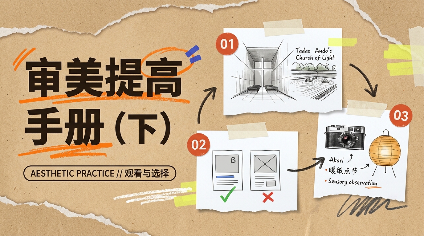
Aesthetic Improvement Handbook in the AI Era (Part 2): Master Observation, Single-Variable Comparison & Real-Space Practice
Style Guide: Aesthetic Practice

Aesthetic Improvement Handbook in the AI Era (Part 2): Master Observation, Single-Variable Comparison & Real-Space Practice

How do you practically cultivate aesthetic judgment? Through 26 high-resolution plates—spanning Ryoan-ji rock garden, Chichu Art Museum, Matthew Butterick typography comparisons, Monet's Wheatstacks, Tadao Ando's Church of Light, Peter Zumthor's Therme Vals, Isamu Noguchi's Akari lantern, Henri Cartier-Bresson, Michael Wolf, and Hiroshi Sugimoto—this handbook builds an actionable aesthetic training loop.

Jaden 抽象日志 @Jaden_riku
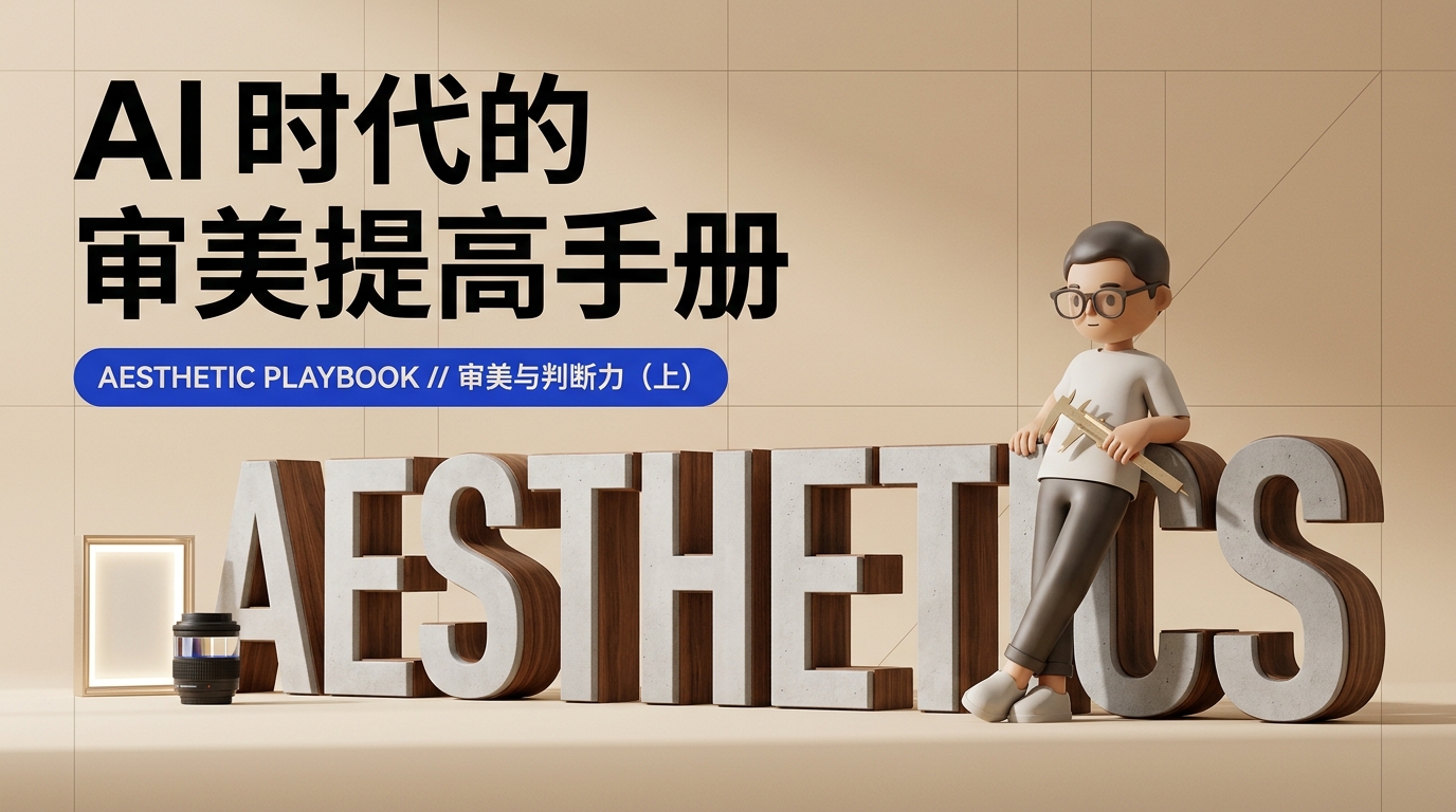
Aesthetic Improvement Handbook in the AI Era (Part 1): Visual Order, Commercial Trust & Social Currency
Style Guide: Aesthetic Judgment

Aesthetic Improvement Handbook in the AI Era (Part 1): Visual Order, Commercial Trust & Social Currency

When AI generates endless variations in seconds, aesthetic judgment and restraint become the ultimate differentiators. Through 21 curated plates—from Tadao Ando sketches, Swiss grids, and Tokyo Marunouchi lighting to Systems Studio stationery and Saul Leiter photography—this guide unpacks objective aesthetic standards, commercial trust, and social currency.

Jaden 抽象日志 @Jaden_riku
Prompt Aesthetics Decoded × Neo-Brutalism: Anti-AI Signal! From Web Rebellion to 3 Prompt Dimensions
Style Guide: Neo-Brutalism Anti-AI

Prompt Aesthetics Decoded × Neo-Brutalism: Anti-AI Signal! From Web Rebellion to 3 Prompt Dimensions

Say goodbye to generic pastel gradients and soft glassmorphism! Deconstruct Neo-Brutalism from 2014 web rebellion to 2021 UI systematization. Learn why raw, handcrafted aesthetics are the ultimate Anti-AI Signal, complete with copy-paste prompts for posters, SaaS tools, and developer docs.

阿哲Phil @Formulasearch

Need Autonomous Agents?

Explore multi-agent workflows, enterprise RAG, and local LLMs.

AI Agent Playbook